Bonitatem et disciplinam et scientiam doce me, as the saying goes. The Latin statement comes from “the old Vulgate version of Psalm 118, v. 66,” Father F.A. Black wrote in an archival letter. He was explaining the existence of the motto in the institutional crest of St. Michael’s College, which dates back to 1879. Father Black then offered a translation: “Teach me goodness, discipline, and knowledge.”
Because of the close connection between the Basilian Fathers and St. Mike’s, which the Fathers founded with Bishop Charbonnel, the two communities shared this crest essentially in common until the early 20th century. The publication of the first St. Mike’s yearbook in 1910 saw the introduction of a new, slightly revised crest for the college, and the older Basilian crest became that of the St. Michael’s College School.
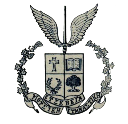
The 1910 crest of St. Michael’s College included a four-quartered shield topped with a winged sword. A script below the crest bore the school motto, translated into Greek from the original Latin in homage to the classical education many students pursued at St. Mike’s.
Moving clockwise from top left, the silver and blue quarters of the shield in the old St. Michael’s crest contain a cross, an open book, a tree, and a laurel. The cross refers to the school’s religious foundation and to the Basilian Fathers who worked tirelessly for the school from the earliest days of its existence. The book evokes the Basilians as well, but also “symbolizes learning, both sacred and profane,” as USMC President Father John M. Kelly wrote in a letter dated 1977.
The tree in the lower right quarter of the crest is taken from the Arms of the University of Toronto, and Father Kelly wrote that the laurel in the lower left corner “symbolizes art, culture, and excellence.” The winged sword is a traditional symbol for St. Michael, for whom the college was named.
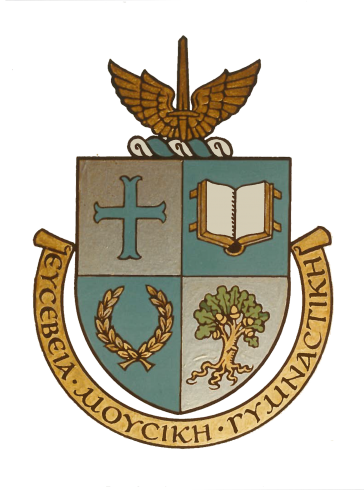
The crest of 1910 appeared on St. Mike’s letterhead, yearbook covers, and buildings for the following several decades, and the winged sword by itself often appeared in place of the full crest. In 1952 the crest—casually referred to as “the Arms,” though without a formal grant by Letters Patent, as Father Kelly noted—was formalized to mark the centennial of the school. A saucer purloined from the school’s cafeteria in 1965 and famously returned in 2010 also bears the school’s midcentury emblem.
In September of 1978, Father P.J. Swan, President of the University of St. Michael’s College, sent a design for a new Coat of Arms to the College of Arms in London, England. As reported in an article in The Mike in October of 1979, the College of Arms “has the legal privilege from the Monarchy to approve coats-of-arms throughout the Commonwealth.” The Queen approved the design for use on diplomas and other school-related documents in August of 1979.
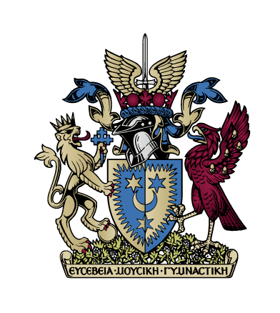
The school’s official Coat of Arms created controversy after it was announced. A group of alumni penned a letter opposing the new Arms to the editor of The Mike. Later, the Council of the Students’ Union also wrote a letter opposing the new Arms, saying “there already exists a suitable Coat of Arms for the symbol of the College” which could be seen “displayed above the door of Brennan Hall, in the tiles of the Brennan lobby, and on all the stationery.” In spite of opposition, St. Mike’s adopted its new Coat of Arms. The Globe and Mail reported on the formal presentation of the Arms in December 1980.
Today, the official Coat of Arms adorns the gate that opens onto Elmsley Place. In the office of the president, it hangs above the official proclamation from the College of Arms, which was penned in beautiful calligraphy. The old crest, however, remains above the door to Brennan Hall.
Though the official St. Mike’s Coat of Arms will remain on file in London unchanged, the school has decided to return to its roots with a new crest.
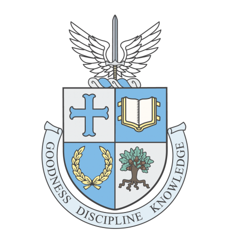
The new crest is actually an old one. Created by design studio Wise & Hammer on the model of the 1952 design, the new crest of the University of St. Michael’s College hearkens back to the emblem that first appeared on a yearbook cover in 1910. It includes the same quartered shield, the same images in the quarters, and the same winged sword. “Goodness, Discipline, Knowledge”—the distilled essence of the Basilian motto—will appear in English in a script below the shield, upholding the school’s tradition of excellence while making the words accessible to those who do not read Greek.
St. Mike’s will also have use of a new script logo in double blue, the school’s original two-tone colour motif. This script will appear on school merchandise and sports jerseys.

The new design honours the history of the college and affirms the continuity of the school’s traditions that now extend over 165 years.
St. Michael’s rose to prominence as a center of the Catholic intellectual tradition under the sign of the quartered shield and winged sword. With the reintroduction of this design, the school both celebrates its Basilian legacy of achievement and invites its current students to join in creating the history of the school’s next era.